
The quickest solution for all your home & office needs — A UX/UI Design Case Study
A team project on designing an android app for a service-based startup in the field of home & personal care.
😎What did I uniquely do here?
This is the project I have done to enhance the Accessibility UX to impact the retention numbers. I can understand the need of having fat-figure sub-categories because many will be elderly and senior users. Therefore, you should consider me. Read along to understand how I did it. ⬇️

📍 Method of approach
◾ Problem Statement
◾ Solution
◾ Project Overview
◾ Understanding the Brand
◾ Need for an App
◾ Target Audience
◾ User Research
◾ User Persona
◾ Customer Journey Map
◾ Common Design Patterns
◾ Deductive Methodology
◾ Ideation
◾ Information Architecture
◾ Wireframing
◾ Branding
◾ Style Guide
◾ Component Library
◾ Visual Designs
◾ Takeaways
🤔Problem Statement
How shall we design a seamless and hassle-free online ordering experience for people who want facilities services?
💡Solution
To build a seamless and hassle-free online ordering experience for people who want facilities services, We designed a mobile app with user needs and business goals in mind.
Scroll down to know more ⬇⬇⬇
🔌Project Overview
We, being surrounded by responsibilities, are overloaded with them. You may even begin to feel a-little physical strain even before you lift a finger to begin. You make a mental list of all the things you had hoped to achieve the day before. Repair the leaking sink in your kitchen, replace a blown-out fuse, find a solution to the growing pest problem in your yard; the list may seem inexhaustible. As digital evolution becomes more momentous, e-service has become almost inevitable. This evolution has been a long time coming, cultivating, growing, and now, it is steadily taking over. Homes across India now rely on tech and applications that connect them to artisans and other services for fixing things around the house, general cleaning, or even any form of beauty services.
👑 Understanding the Brand

QuickGhy is a marketplace for services — a place where you can access all kind of homecare and personal care services customized to your need. From Faulty wiring, Leak taps to Hair Dressers, Home tutors for your children, Architects for your new dream house or for maintenance, to capture your special moments QUICKGHY is the quickest and most convenient way to solve all your home & office needs.
The goal is to make the customer as comfortable as possible and ensure getting the service they want is seamless and fast. As a result of its innovative approach and potential, the company is currently incubated under Assam Startup; The Nest, and IIM Calcutta Innovation Park. QuickGhy has established itself as one of the most promising startups in Guwahati.
📱 Need for an App
The secondary research that we conducted to understand the methodologies and features adopted by apps in this domain suggested that having an app in the initial stages has the following benefits -
◾ Users can place their orders whenever they wish to
◾ Navigation is simpler as compared to the desktop website
◾ The process from ordering the services and paying for the same would be seam-less and hassle-free
◾ It is easy to keep track of the progress made
🎯 Target Audience
The startup is focusing on people based in urban areas of Guwahati. Those who are mainly students, working professionals, or homemakers from age groups between 14years and 40years; have a decent income and a decent way of living.

🧪 User Research
To understand the user needs, we had rolled out a questionnaire. We preferred the User Interview and conducted it on 8 People. The main findings from this were:

👩User Persona

🗺 Customer Journey Map
We preferred a User Journey Map to explore the unexplored aspects of the services ordering process to align the application to the user needs.

🕸 Common Design Patterns
We browsed through different apps in this niche and found out the following common design patterns —

😠 Pain Points
After conducting the research and analyzing the information gained throughout the process, we enlisted the major pain points that the users are facing. The major pain points were:
◾ No work-life balance which ends up them feeling frustrated
◾ Lack of motivation
◾ Often feels overwhelmed
◾ Lack of time-management
◾ An inexhaustible list of all our home and office needs
◾ Feeling out of place and stressful
👨🏻🏫 Using Deductive Methodology
We ideated on the theory, hypothesis, observation, and confirmation/rejection of the insights gained from primary and secondary research. Being an iterative process this approach helps in understanding the user, their challenges, assumptions with an attempt to redefine the problems. In order to identify alternative strategies and solutions that might not be instantly apparent with our initial level of understanding.

💡 Ideation
Before proceeding to build the sitemap and the wireframes, We ideated and prioritized features for the app. The features were:
- OTP based Mobile number login (primary)
- Pay for various services in one go
- Map to show the order progress
- Active interaction with QuickGhy’s helpline number
- Scheduling more than one servicer for the same service (like, beauticians)
- Slots to show the scheduled services
- Providing emergency services (like, car breakdown)
- Booking multiple services all at once
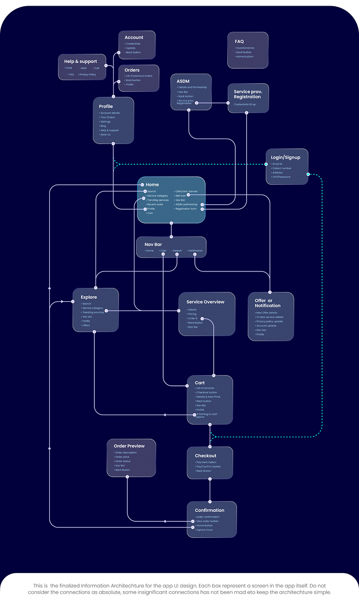
⛓ Information Architecture
Taking the features we ideated and insights gained from research into account, we built the visual representation of product infrastructure.
🔨 Wireframing
We iterated on the wireframes for the app to come up with layouts that serve the essential features of those pages without hampering the user experience.
After making rough sketches, We moved to Figma where we iterated with several different layouts for the screens as well as screen components.

🤵🏻 Branding
We explored different logo symbols and wordmarks for the startup. After some explorations being perfection obsessed, We tried designing one that represented the idea of QuickGhy.

🎨 Style Guide
From the wireframes, we chose a few crucial screens and experimented with different color combinations and typeface combinations.
- Since it is a facilities service app that is mostly used in daytime, we decided to keep the UI in light mode. This will also enhance the readability of information given regarding various services and does not strain the eyes of the users.
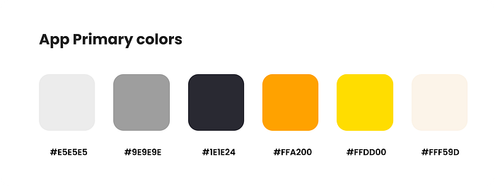
- We iterated with different fonts before settling for ‘Poppins’ as it gives a clean and modern ligatures.

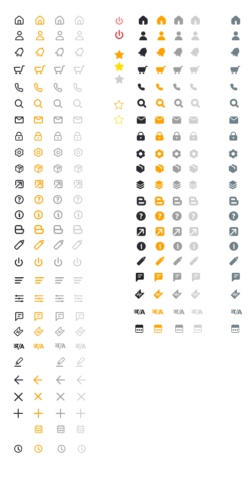
- We planned on using consistent icons with smooth corners so that they match with the personality of the product.
- After making rough sketches, we moved to figma (again) where we iterated with several different illustrations for the app with the screen components that can be depicted to be more user friendly.

⚓ Component Library
Since in this project, we had planned on designing for edge cases so we started building a component library through an iterative approach. Throughout the project, the major components were added to the library.

✨ Visual Design
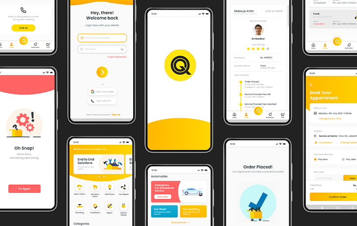
We iterated different layouts and used the component library to fasten the process. Then We designed different screens(taking into consideration the edge cases as well) for the app. We iterated and improved upon the visual designs based on the numerous feedbacks that we received.
• App Walkthrough
Simple and minimal walkthrough showing the essential features of the app to the users. As I want to serve their needs with minimum clicks.
Sign Up/Login Screen
Sign up and login through email for users who are more tech-oriented and familiar with emails. This process is short and fast to maximize user retention.

Home and Section Screen
Ordering services can be mind juggling. Therefore, here we focused on easy navigation through the multitude of options available to the users at the platform.

Order Tracking Details
These screens will help in keeping the users updated with their servicers location and their order progress.

Appointment Booking
Users can save and change through multiple address based on their convenience.

Settings Screen
Generalized settings screen for first-time users and personalized settings screen for returning and regular users to maximize user retention. Settings screen contents are in descending order of priority.

Help and Support Screen
Get detailed feedback from the helpline service provided by the team.

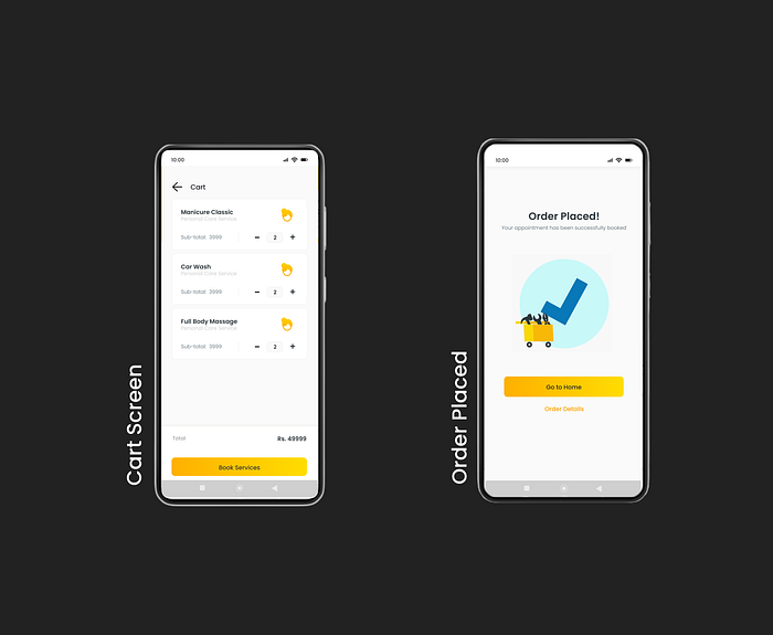
Check Out
Easy checkout flow to allow users to order for a service.
🎁 Takeaways
There main learnings for me during this project were:
- Designing the user experience and interface, can’t be learned through traditional-method of watching tutorials. Practice and feedback are much needed.
- I understood the importance of iterating for real needs. There are 100 possible ways to design a screen, but only a few of them will work. Iterating gives an idea about the layouts that would work and which one should fit my product.
- Designing for edge cases. How to take into consideration different edge cases while designing a product.
- Using constraints to design responsive screens.
Thank you Rohit Deka for trusting me with this project and providing helpful insights.
Thank you for reading till the end! Did you know? You can hold that clap button for a few seconds to give a maximum of 50 claps. I would really appreciate it. See ya!
